Table and Field Properties
The configuration of Tables, Fields, Relationships and Renderers have specific properties that can be set to control behaviours, appearance, etc.
Tables properties
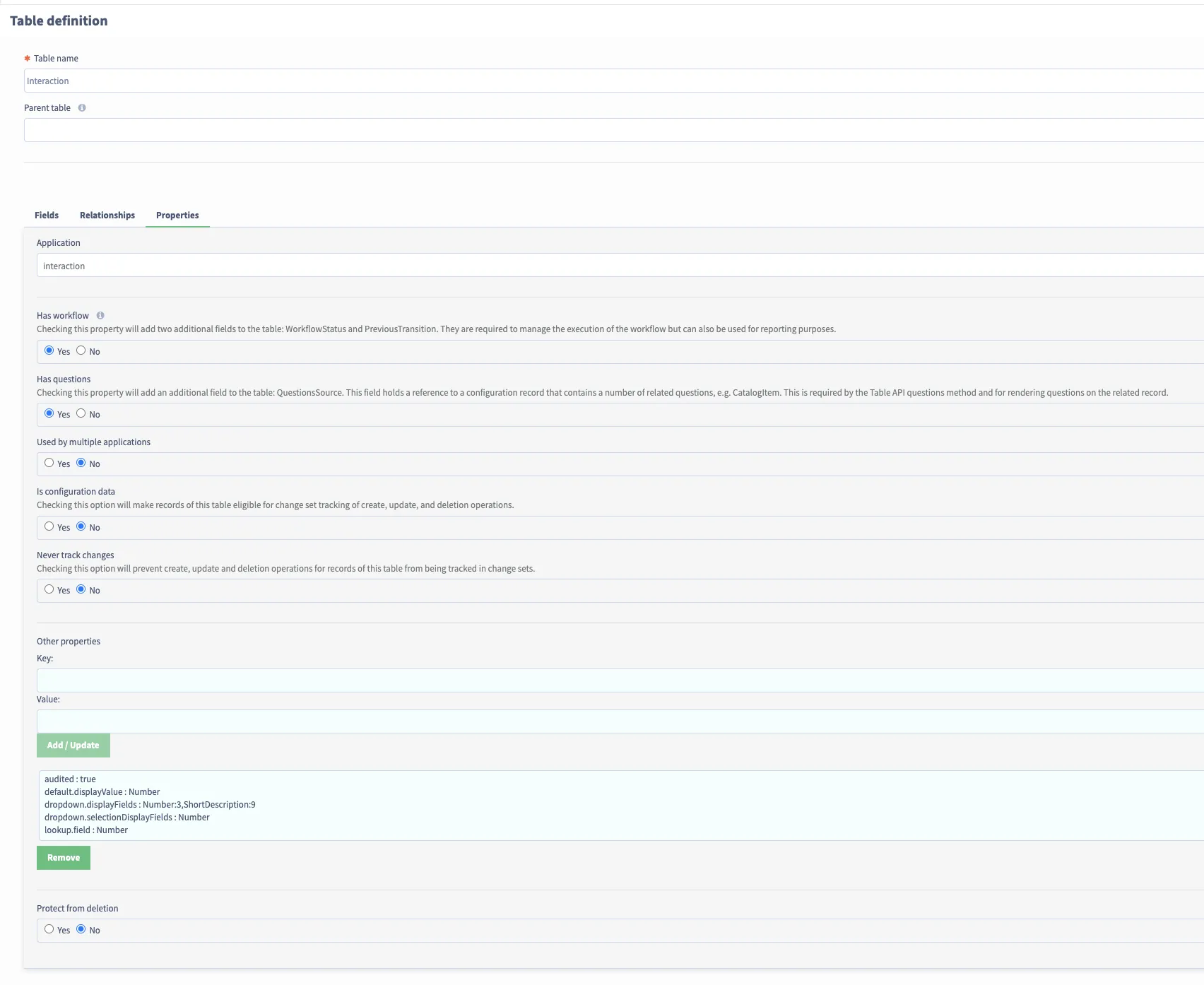
The following properties can can be configured against the Table itself. This is done from the Key/Value section on the Properties tab for the Table definition:
Property | Example | Comments |
|---|---|---|
i18n.name | table.work.name | The i18nKey of the localised name of the Table. Note: this generated automatically on Table creation, along with the default localised value, and normally not needing to be altered. |
default.displayValue | Name | The field that is used to represent as the displayed value when this table when referenced elsewhere (such as from a reference field on another table). |
default.requiredField | true | A boolean value (default false if not present) of whether this field is always required to be provided for this table. |
audited | true | A boolean value (default false if not present) of whether the various write/write operations on the records of this Table are audited. |
dropdown.displayFields | Number:6,ShortDescription:6 | Used for what fields are displayed in drop down lists in the UI when references to this Table are being selected. The format is: <FieldName>:<relative size>, <FieldName>:<relative size>,... The relative sizes should add up to 12. e.g. with two fields and 6 and 6, each field will occupy half the layout. Similarly, 3 and 9 would be one quarter and three quarters. Examples: Table dropdown.displayFields User Name:4,Email:8 If you are using this on a large table, it is recommended you use the searchFields property as well to allow you to still show the field in the dropdown, but to only use certain fields as part of the search / query. |
dropdown.selectionDisplayFields | Name | Typically the same as the single valued default.displayValue property, but can be used when multiple fields are required. |
dropdown.searchFields (New in later 1.8 releases) | Number,ShortDescrpition | Comma separated list of fields to search. If this has been added, this will be used to search the table instead of display fields. Allowing you to have separate fields to search on and show on the dropdown. |
workflow.action.journal (New in 1.9) | ClientJournal | Used to determine where the approval message / status is given upon a user approving / rejecting an approval. |
lookup.field | Key | If set, will allow lookup by this value as well as by ID. This field should be marked as unique. |
Note: You may see some other properties in Tables, which are valid, but have been replaced by a field on the Table configuration.
Field and Relationship properties
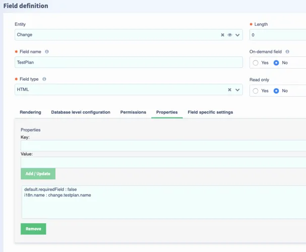
The following properties can can be configured against the fields and relationships on an Table. This is done from the Key/Value section on the Properties tab for the Field definition and the Relationship settings for the Relationship definition:
Property | Example | Comments |
|---|---|---|
i18n.name | work.requestor.name | The i18nKey of the localised name of the Field/Relationship. Note: this generated automatically on Field/Relationship creation, along with the default localised value, and normally not needing to be altered. |
css | script:WorkServerUtil.getNumberFieldStyle(current) | This property will style the field on a list view of a table based on an array of css class the selected function returns. In this example, the property is used for the Number field on the Work table. WorkServerUtil is an out of box Script Library and the function “getNumberFieldStyle” returns the nominated css class determined by the current record’s information. For other fields and other css classes, you can create your own Script Library functions and then call that function from the css property value for the field/relationship field of your own choosing. Example of the styling showing blue circles on the Number field for the INC records that require attention due to requested for reply back to it: 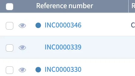 |
default.requiredField | true | A boolean value (default false if not present) of whether this field is always required to be provided for this table. |
default.value | true | The default value for the field when a record is created. |
default.fieldInstructionText | myfield.instruction.text | The i18nKey of the localised text for the default instruction text for the Fields/Relationships on forms. Specific views (aspects) may have different text, configured in the view. |
default.tooltipText | myfield.tooltip.text | The i18nKey of the localised text for the default tooltip for the Fields/Relationships on forms. Specific views (aspects) may have different text, configured in the view. |
dependent.on | Classification | This is used for a Choice field whose Available Values is dependent on another field / filtered depending on the other field’s value. The property value needs to be the name of a field that the Choice field is dependent on. |
displayUnit | seconds | This is the display unit that is shown on a duration field. Values can be one of the following
|
configuration.data | true | Add and set to true on a Relationship property of a many to many reference (created by a multi reference field), to automatically capture the changes to the many to many records into a change set, without needing to change the change set’s mode to “Tracking all changes”. |
Renderer properties
Renderer properties are Field/Relationship properties specific to a specific view, rather than generally for the Field/Relationship. They are accessed via the the Form configuration form (via "Configure layout" under the tool icon in the upper right of a form), then the small "cog-wheel" above a field on the form.

The following properties can be configured against the fields and relationships renderers. This is done from the Key/Value section on the Renderer section:

Field Renderer Properties
Property | Example | For (field type/layout element type) | Comments |
|---|---|---|---|
dependent.table.field | TargetTable | Condition | Used for fields such as conditions, that are dependent on the Table they associated with. |
basic.toolbar | false | HTML | HTML fields by default have limited controls on editing, so as not to crowd the screens where they are commonly used. This makes them practical for fields such as client journals, etc. However, some fields require more sophisticated editing, as well as toggle for HTML editing. Setting this property to false enables the full control. |
inline.editor | false | HTML | HTML fields can have in-line controls when you click into the field. This will mean when you click into the field, it will provide certain options. This is typically how our Journal fields work out the box. |
enableCreateButton | true | Related list | This determines whether or not the “New” button will show up for related lists. Note that this does not overwrite permissions that are user may have to the field or target table however. Starting in version 1.10, you can also use this for custom related lists. |
enableQuickEntryButton | true | Related list | This determines whether or not the “Add/Remove” button will show up for related lists. Note that this does not overwrite permissions that are user may have to the field or target table however. |
enablePreview | false | Reference | This determines whether or not the eye/preview button will appear for reference fields. By default this is true for all reference fields. |
accounting.currency | R | Decimal | This prefix’s an account field with a type of currency. This is for use with the accounting renderer. |
accounting.currency.font.size | 14px | Decimal | The size of the prefix. This is for use with the accounting renderer. |
accounting.currency.name | Rand | Decimal | The name of the currency name. This is for use with the accounting renderer. |
expanded | false | Collapsible panel | Used for Collapsible panel layout element. If set to false, the collapsible panel will be collapsed by default and true for the opposite. Note that if this renderer property isn’t added to the layout element, the Collapsible panel will be expanded by default. |
columnList | Number,ShortDescription,WorkflowStatus | Related list | This allows you define the specific fields a related list can show, if it needs to be different to other views of that list. |
sortOrder | ShortDescription | Related list | This allows you define the specific sort order a related list can show, if it needs to be different to other views of that list. If you want to order it in descending order you can do the field with :desc, such as ShortDescription:desc |
Table List Renderer Properties
Property | Example | Comments |
|---|---|---|
accounting.currency | R | Used to prefix a field with a currency symbol. |
relative.time.units | “days, hours” | To use this functionality, you need to be on Version 1.10 or later. Which units to display in the field |
relative.time.unit.display | “long” | To use this functionality, you need to be on Version 1.10 or later. Should the units be short or long |
relative.time.format.display | “date”, “relative”, ”both” | To use this functionality, you need to be on Version 1.10 or later. Should the date be displayed as well as the relative time |
relative.time.format.future.key | relative.time.future.remaining | To use this functionality, you need to be on Version 1.10 or later. I18Key for future relative times |
relative.time.format.past.key | relative.time.past.overdue | To use this functionality, you need to be on Version 1.10 or later. I18nKey for past relative times |
Catalog Question Rendered Properties
Property | Example | Comments |
|---|---|---|
reversed | true | Set to true so the label of the catalog question will appear to the right of the question. Use case will be having a checkbox question with the label to the right of the checkbox |